CSS3D game tutorial
October 2016 - June 2017
This article is aimed at developers that are already familiar with JS game making and CSS3D.
If you don't already know CSS3D, I also recommend reading the following resources:
- An Introduction to CSS 3D Transforms
- Things to watch when working with CSS3D
- Keith Clark's articles and demos about CSS3D engine, lighting, shadowing, etc.
- Super Mario Kart in CSS, it's heavy, old, not optimized, not cross-browser, but that's what inspired me to do this today :)
I won't cover all the features of CSS3D, but instead I'll focus on some discoveries I've made, like how to deal with the rotation and translation axis, how to simulate a camera and how to make CSS3D scenes interactive with a little bit of JS.
In parallel with this article, I'm updating this Github repo with my experiments.
Why?
Why make games in CSS3D? Because it works fine (most of the time), because it's fun and hacky, and also because it's super lightweight! You can literally make a 3D scene interactive with a few lines of HTML, CSS and JS (example) (demo), so it can be useful for lazy coders, or code-golfers trying to work with the size limits of js1k or js13kgames!
Spoiler: 3D games often are just 2D games plus perspective
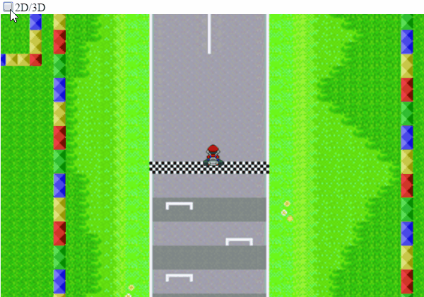
It seems stupid to say it like that, but it's one of the most important things I realized while experimenting: if you can make a 2D game in JS (for example a chess game or a racing game seen from above, or anything else you can imagine), you literally just need to look at your scene from a slightly different angle and you have turned it into a 3D game "for free".
You can see what I mean with this Mario Kart prototype: the only real difference between the 2D view and the 3D view is rotation of 80 degrees along the X axis!
But we'll see that in greater detail later.
So let's get started with CSS3D!
Nowadays, CSS3D is pretty easy to use. Modern browsers don't require vendor-prefixes anymore and their performances are... decent.
All you have to do is set "perspective: 400px" to a container in your page (avoid the <body> though) - of course you can replace 400px with any length you want; as far as I understand, this length represents the distance between the container and the virtual camera that will "see" the scene in perspective. (the lower the perspective, the more deformed the scene is). Then fill the container with elements, apply all the CSS3D transforms you want to these elements, don't forget to set "transform-style: preserve-3d;" to render them in "real 3D" (otherwise, the browsers will flatten all the scene and make it look as if it's in perspective, but there would be no depth at all in reality), and you're done!
But now, let's dig into some subtleties that you may face while playing with this new toy!
Subtlety #1: HTML elements vs. axis, translations and rotations?
By default, each HTML element of your page is drawn at a certain position according to the flow of the page and the CSS you applied to the element, its neighbours and its ancestors. It has no translation and no rotation, and its default transform-origin it at their top-left corner. This transform-origin is editable, and it's the starting point of all the possible CSS transforms, but six of them are particularly important here: rotateX / Y / Z and translateX / Y / Z. The X axis goes on the right, the Y axis goes downward, and the Z axis goes in depth towards your eyes, as you can see in the following demo:
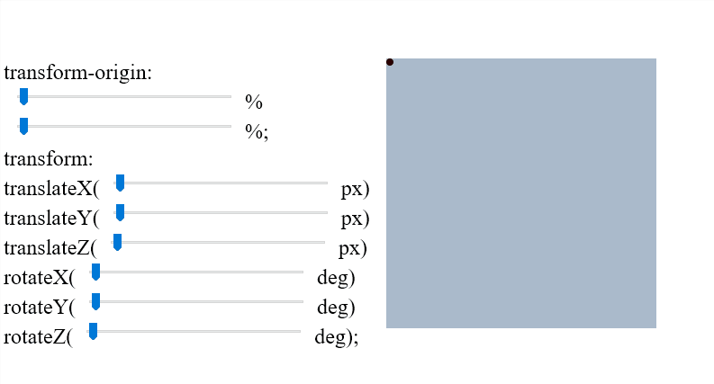
The demo above allows to move the transform-origin of a square (represented by a red dot), and allows to translate in X,Y and Z axis and rotate along X,Y and Z axis, in this order. All the range inputs go from 0 to 100 (regardless to the units used).
Note that translateX and translateY can be expressed in percent units, but not translateZ. If you try to sate a translateZ in %, the whole transform will be discarded.
Note also that the order of the transforms is extremely important. For example here, you can translate the square then rotate it, but you wouldn't get the same result if you rotated the square before translating it. Transforms are accumulated from the first one to the last one, while the transform-origin can only have one value used by all the transforms. (of course, even if its value never changes, the transform-origin moves with the element when it's translated).
This principle allows, for example, to rotate an element, then translate in, then rotate it back to the original angle, to make an object move around a circle!
Finally, note that the X, Y and Z axis of an element can have different orientations than the ones by default if a parent element is rotated. (for example, if the parent of the square above had a 90 degrees rotation along its X axis, the square would undergo this parent transform and have its Y and Z axis rotated 90 degrees along the X axis of the parent, i.e. the Y axis would behave like a Z axis and the Z axis would behave like X axis.
The other possible CSS transforms include matrix, translate, scale, scaleX, scaleY, skew, skewX, skewY, matrix3d, translate3D, scale3D, rotate3D and perspective, but we won't study them here. ( for the record, matrix3D has very interesting applications!)
Subtlety #2: The HTML structure
Even if a container (with perspective) and its children (with CSS transforms) are enough to test CSS3D, a good HTML structure will make your work (and calculations) much easier, especially if you want to do a CSS3D game. Here's the one I recommend:
First, you need a viewport (the equivalent of a canvas element when you do a canvas-based JS game). For example, use a 600x400px div. The perspective will be applied to this element.
At the center of this viewport, we place a 0x0px div called "camera". It's not REALLY the camera (more details in the next paragraph), but the point that will always be watched by the camera, something like a global transform-origin for the game.
Inside this "camera" point, we can place a scene container with a defined size and inside it, all the scene objects in their order of appearance (for a better browser support - more details at the end of the article). For example, we can put inside the kart, the tree, and finally the circuit.
Here's the template's HTML:
<div id=viewport>
  <div id=camera>
    <div id=scene>
      (...scene content...)
    </div>
  </div>
</div>
And CSS:
* { transform-style: preserve-3d; box-sizing: border-box; }
#viewport { width: 600px; height: 400px; overflow: hidden; perspective: 400px; }
#camera { width: 0px; height: 0px; position: relative; left: 300px; top: 200px; }
#scene { width: 4000px; height: 4000px; transform-origin: 0 0; }
/* scene content... */
#scene { transform: rotateX(80deg) translateZ(-70px); }
All your scene objects can be placed in the scene the same way you'd place them in 2D on a HTML page (using left/top, or margins, or translateX/Y, etc.).
The last CSS line (rotateX and translateZ on the #scene element) enables the 3D view, exactly like in the previous Gif. The translateZ is optional, its goal is to place the camera a little above the scene, and avoid some bugs (more details later).
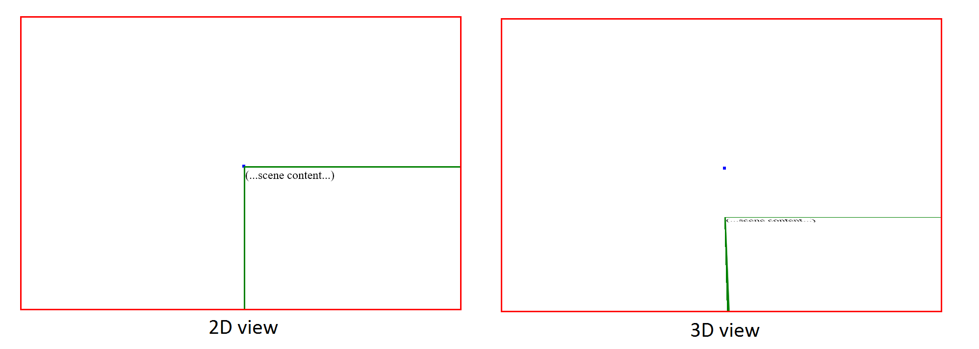
You can find a demo HERE.
In this demo, the viewport is shown in red, the camera in blue, and the scene in green (you can see the top-left corner of the scene in perspective).
In the screenshot below, you can see what the template looks like before and after adding the last line of CSS (the 3D toggle)
That's all! Everything else depends on your content and your creativity!
Subtlety #3: A "camera"?
In a webpage, there's no "camera", but there's a viewport (the portion of the page visible in browser's window).
In most cases, and even in 2D games, the notion of camera is completely neglected, and we generally call "camera" the current view, i.e. the rectangle in which the user can see your game.
But in 3D, we should never forget that the camera is a point in the space, and the scene is "seen" from this point.
Remember, when you make a scene in CSS3D, you set a given perspective to a container, and it defines how all the children are rendered. Well, here it is! If your scene has a perspective set to "400px", the camera is just 400px away, along the Z axis. Its a virtual point in the air between your screen and your eyes.
So, can you guess what happens if you perform a "translateZ(400px)" transformation on your scene?
Yep, what you get is a first-person view!
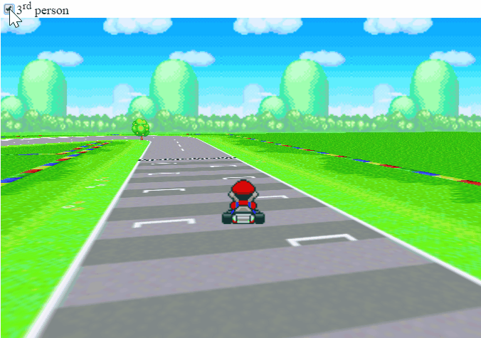
Here you can see the translateZ(400px) being enabled and disabled in the Mario Kart prototype (there's also a toggle of the kart's opacity), and of course, you can have this transformation always enabled if you make a CSS3D FPS for example!
Subtlety #4: Interactivity!
Adding interactivity (controls) to a 3D scene is rather simple if you're well organized and keep a few trigonometry basics in mind:
(NB: the following tips mostly apply to CSS3D games with first-person or third-person view, like a FPS or Mario Kart.)
For example, you may want to look around you using the mouse or the keyboard, so you can declare a var called angle_z, and update it every time you move the mouse or press Left/Right arrows.
For more simplicity, this var will contain your Z rotation in radians (one turn = 2 * PI ~= 6.28 radians). It's possible to use degrees but all the JS Math functions work in radians and you'd need to convert units all the time, so I don't recommend it.
You'll probably want to move too, that's why you can declare two vars x_pos and y_pos. If you're surprised by the "Y" axis used to walk forward and backward, remember that our 3D game starts as a 2D game, and in 2D, the Y axis allows you to move up and down, which will become a forward-backward movement after passing in 3D view. These vars can be updated with keyboard inputs for example.
Remark: naively, we can think that it's okay to move along the X axis when we press left and right keys, and move along the Y axis when we press up and down keys, but in first-person or third-person view, it's often not what we want at all. What we want is to go forward according to our current angle! So when we press "up", the right thing to do is probably something like:
pos_x += walk_speed * Math.sin(angle_z);
pos_y += walk_speed * Math.cos(angle_z);
Finally, we want to apply these vars to our scene at each frame, and to do so, we just have to generate a CSS transform string and apply it with JS; something like:
scene.style.transform = "rotateZ(" + angle_z + "rad) translateX(" + pos_x + "px) translateY(" + pos_y + "px)";All the rest is just a slight variation of this principle. For example, to place the kart at the right position and the right angle, in front of the camera, you have to do something like:
kart.style.transform = "translateX(" + (-pos_x - kart_width / 2) + "px) translateY(" + (-pos_y - kart_width / 2) + "px) translateZ(" + kart_height + "px) rotateZ(" + (-angle_z) + "rad)";It takes a few fails and retries to get the right values and the right order for all the transforms, but with practice it becomes more and more logical and natural.
Hack: if you're super lazy, your third-person sprite (for example the kart) can be placed over the viewport! You can see a demo HERE. The illusion is perfect... until something passes between the subject and the camera...
Subtlety #5: browser support?
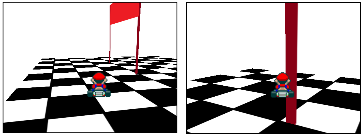
I said earlier that CSS3D works fine... most of the time. Indeed, you may encounter a few glitches, or even some elements that disappear completely while they should be here, but that's the fault of the browsers, and Firefox in particular.
First, some parts of the scene can look broken if the camera is too close to them. It happens with the road for example, as you can see during a few frames of the previous GIF. This happens on both Chrome and Firefox, but for their defense, my camera was VERY close to the road (like, 20px high). The solution is to put the camera a bit higher.
Then, with the great help from Keith Clark, I understood why Firefox hides the kart behind the scene in this case:
https://t.co/3dQEHSz4zW
— xem (@MaximeEuziere) 3 octobre 2016
Most Chrome glitches are fixed by putting the camera a bit higher. But sadly @Firefox still has too many depth bugs: pic.twitter.com/phGJaGOGTU
As you can see in his super detailed pull request, the order of the elements in the DOM is super important to help the browsers draw the "above" elements above, and the "below" elements below, and not the other way around. He also explains that Firefox completely stops doing any depth-ordering effort if your scene contains more than 100 children. In that case, you need to reorganize your DOM manually at each frame... or more realistically, just completely drop Firefox support for your game!
2017 update:
- My JS1k entry "Can I haz 1Karrot" uses many tricks discussed here plus a lot of new ones. It arrived 8th!
You can read more in the dedicated blog post and detailed source code HERE.
- Since April, Firefox no longer limits CSS3D scenes to a maximum of 100 elements! You can use as many elements as you want, but don't rejoice too fast: Firefox is still very glitchy with CSS3D...
- My JS13KGames entry LOSSST is also entirely rendered in CSS3D (and emoji). It arrived 1st twice and 2nd twice.
There's a complete making of HERE
Happy game making! If you have questions, feel free to get in touch on Twitter, Gitter or Slack!
Cheers,
@MaximeEuziere